

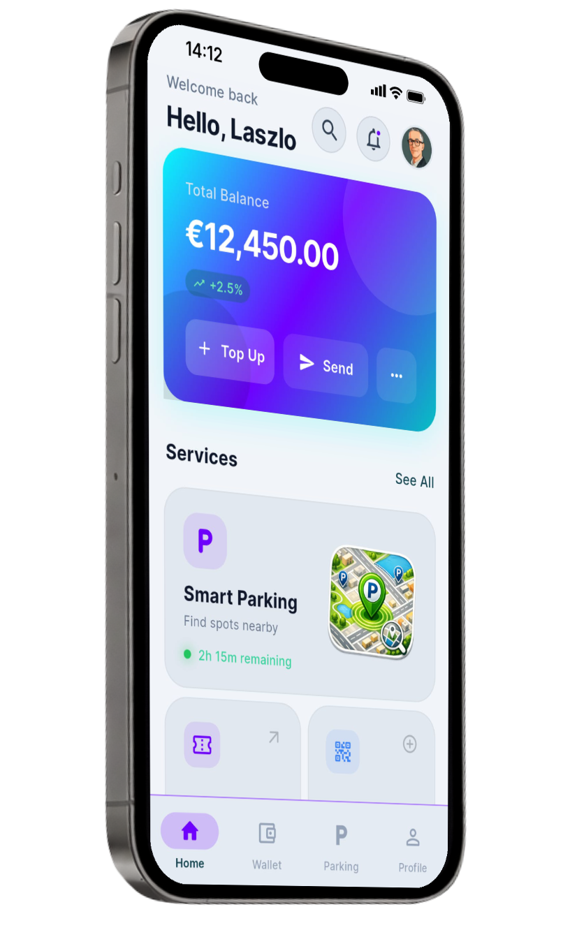
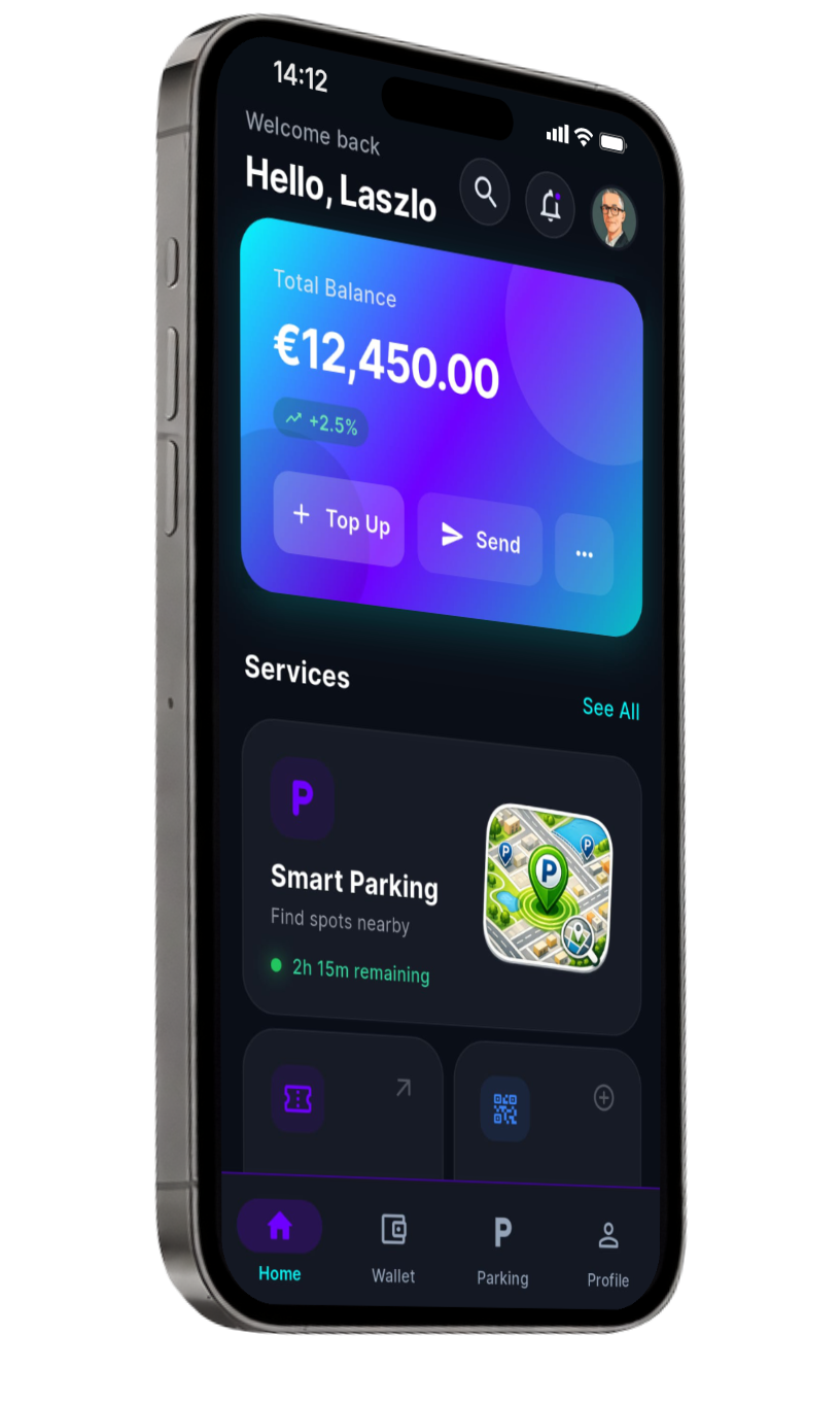
/ Project Overview
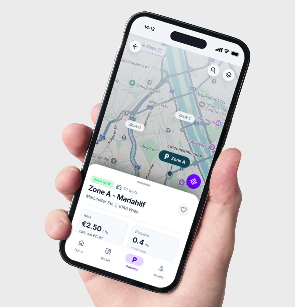
The modern Designer-as-Builder workflow shifts the focus from static screens to functional product logic. After structuring the product environment with NotebookLM and Google Stitch, I used Google Antigravity, Flutter, and AI-assisted development workflows to turn UI concepts into a working, deployable wallet application.
Solo Designer & Builder
UX/UI Design · Android APK · Web App
electronic / Wallet / app = eWa
Electronic Wallet
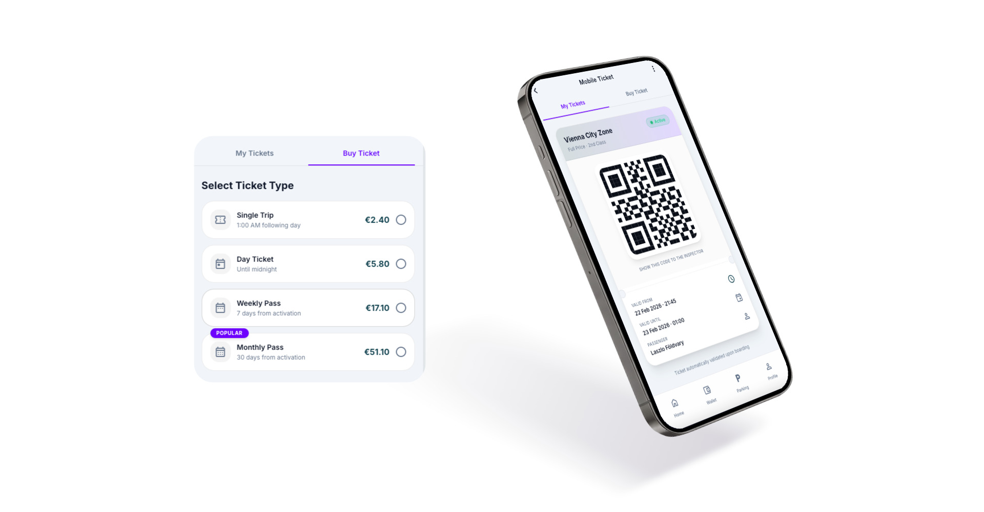
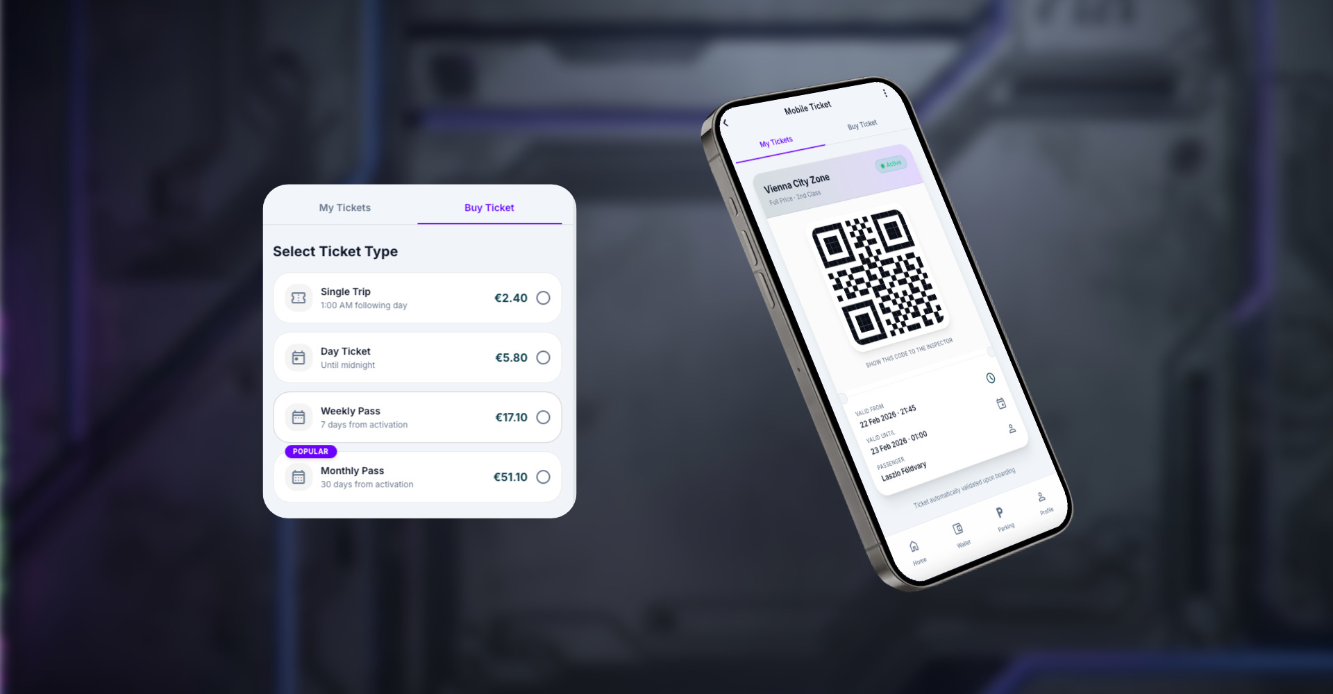
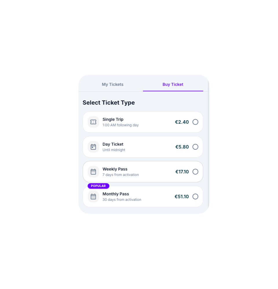
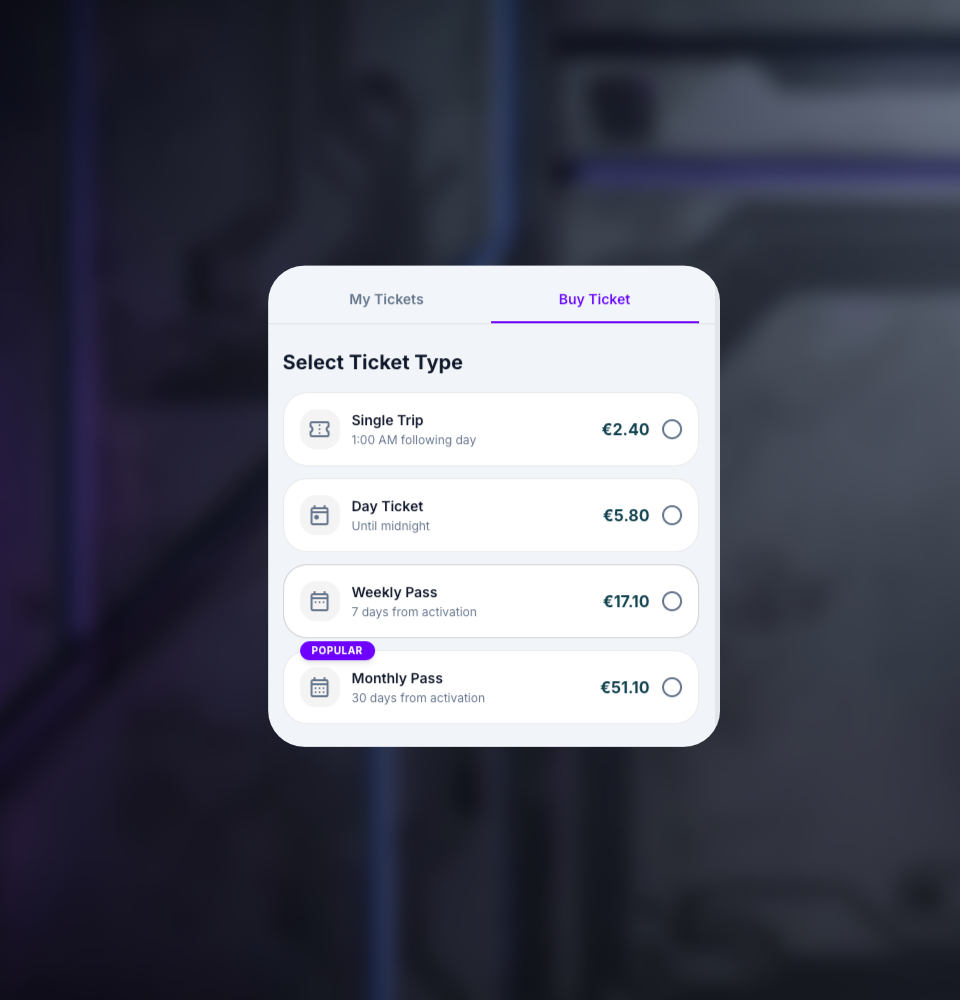
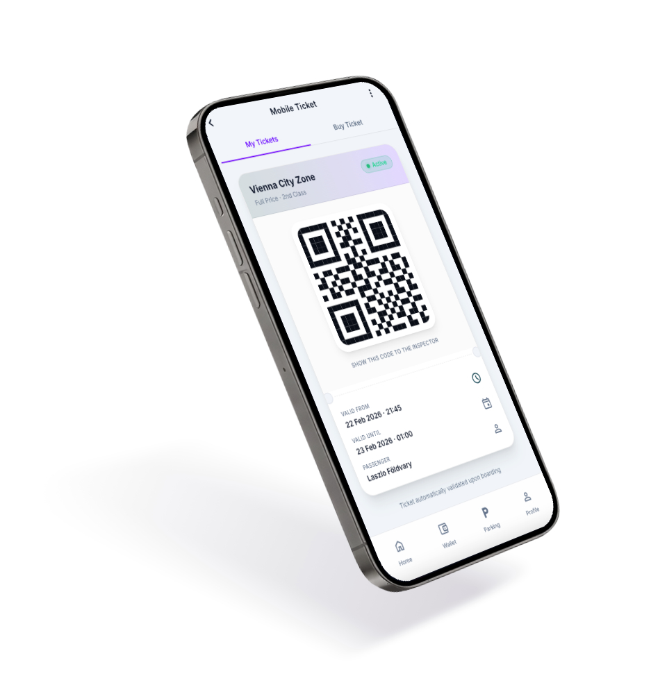
Mobile Tickets
Smart Parking
E-Vignettes
/ Executive Summary
The Austrian Mobility Wallet Challenge
Designing a wallet app means balancing complexity and trust. The product needed to combine several everyday mobility and payment services — smart parking, e-vignettes, mobile tickets, wallet flows, and account management — without overwhelming the user.
The challenge was to create a product architecture that feels simple on the surface, while still being robust enough for financial interactions, mobility services, and clear Euro-based transaction logic.
For the Austrian market context, I focused on privacy-minded UX, data clarity, readable financial information, and a clean visual system that feels trustworthy rather than overloaded.
Installing the APK may require enabling "Unknown Sources" in your Android settings.
Key Tech
Figma, Google Stitch, NotebookLM, Google Antigravity, Flutter, Next.js
Core Challenge
Working Android APK, Web App & Design System
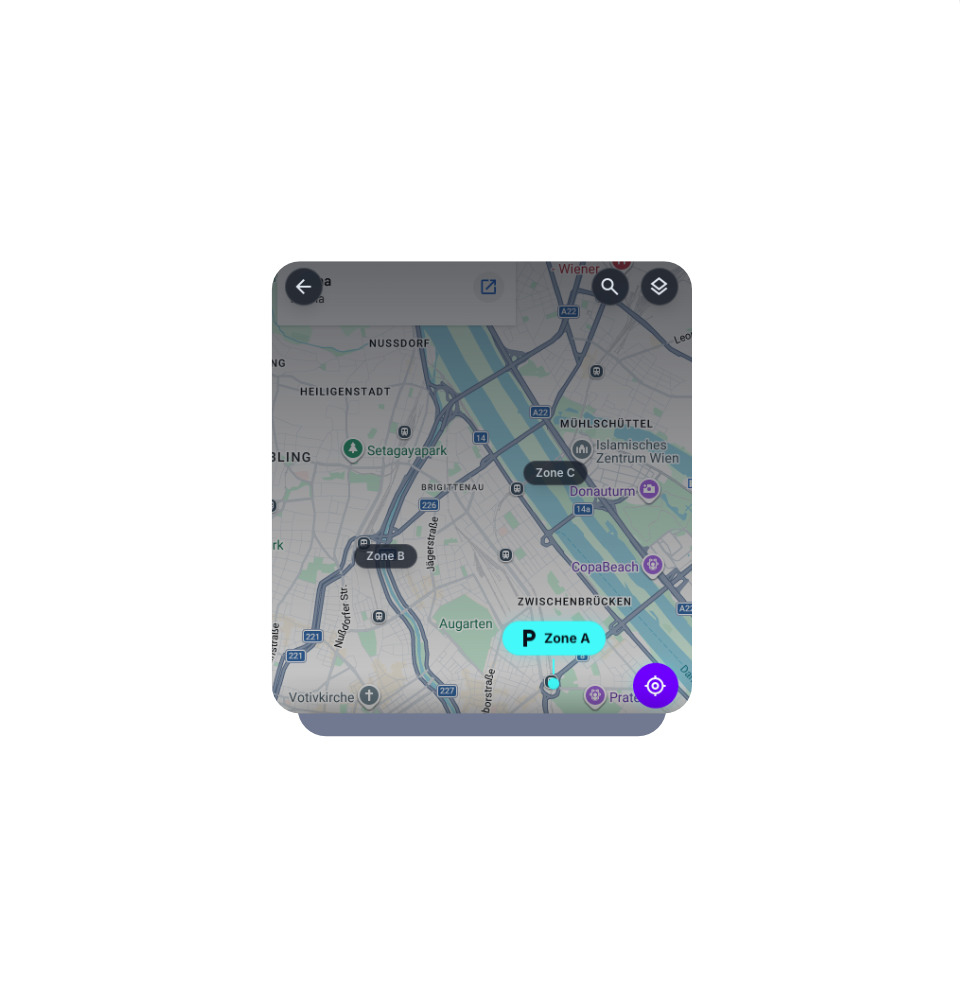
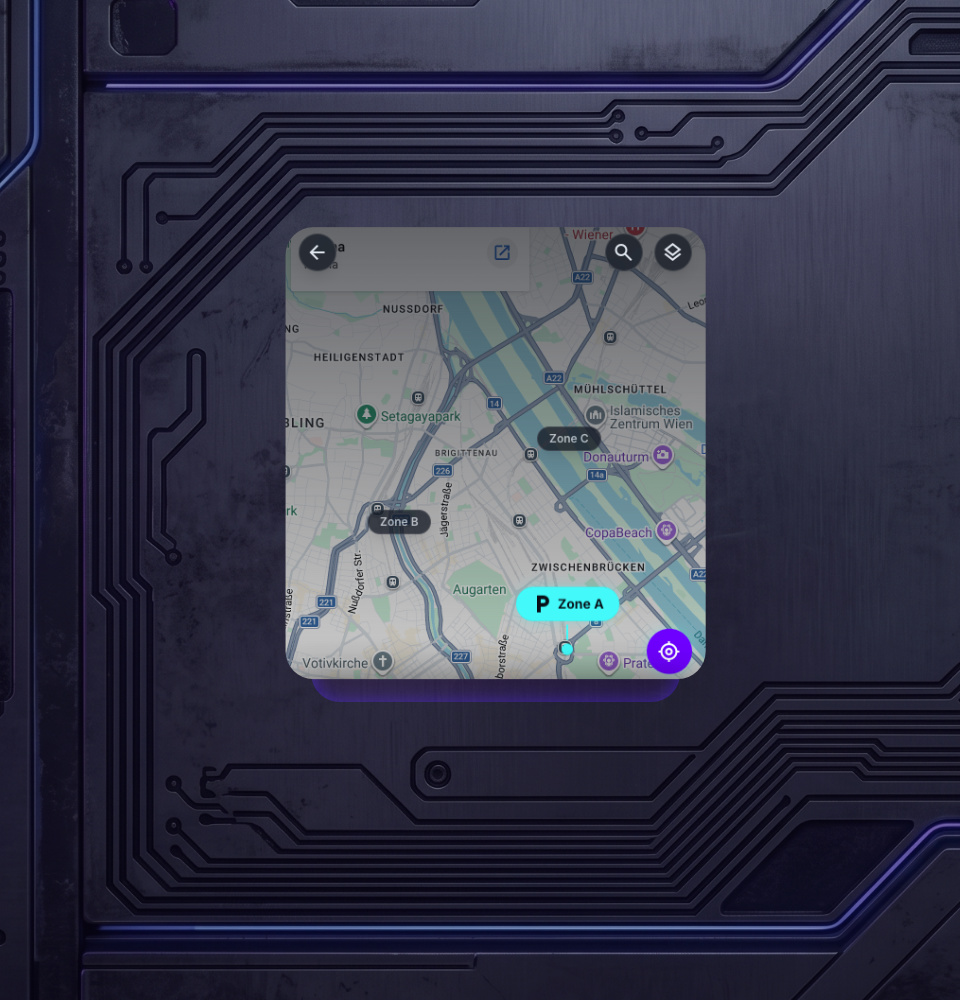
/ Live Demo
Try the Live App:
Experience in Action
Interact with the actual eWa Wallet App directly in your browser. Explore the interface, test the flows, and see how the product design translates into a working application.
/ Design process & Timeline
Structuring complexity from initial product logic and user flows to high-fidelity UI architecture, with a focus on clear payment paths and working product execution.
Research
Design
Development
/ UX/UI Solution
Architectural Scalability:
Beyond Aesthetics
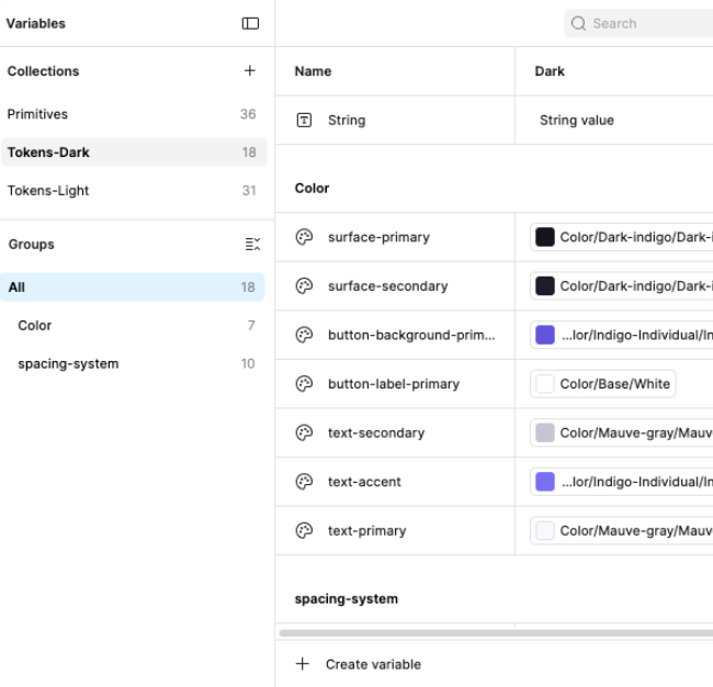
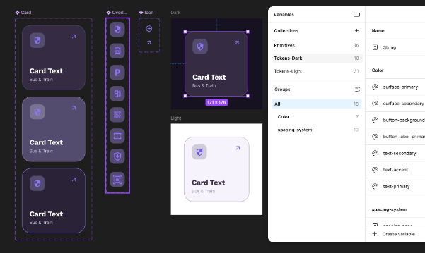
Token-Driven Framework: I replaced static styling with a semantic variable system for colors, surfaces, typography, and interface states. This made the visual system more consistent, scalable, and implementation-ready.
Engineering Alignment: The design structure mirrors implementation logic. Components, states, and tokens create a shared language between interface design and front-end execution.
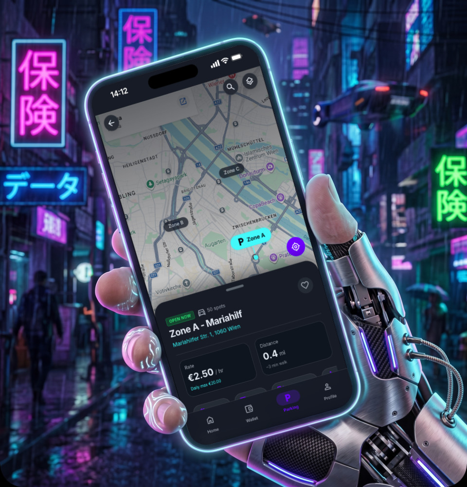
Adaptive Experience: Light and Dark themes are treated as system-level outputs, not separate visual skins. This keeps contrast, readability, and trust consistent across different usage contexts.
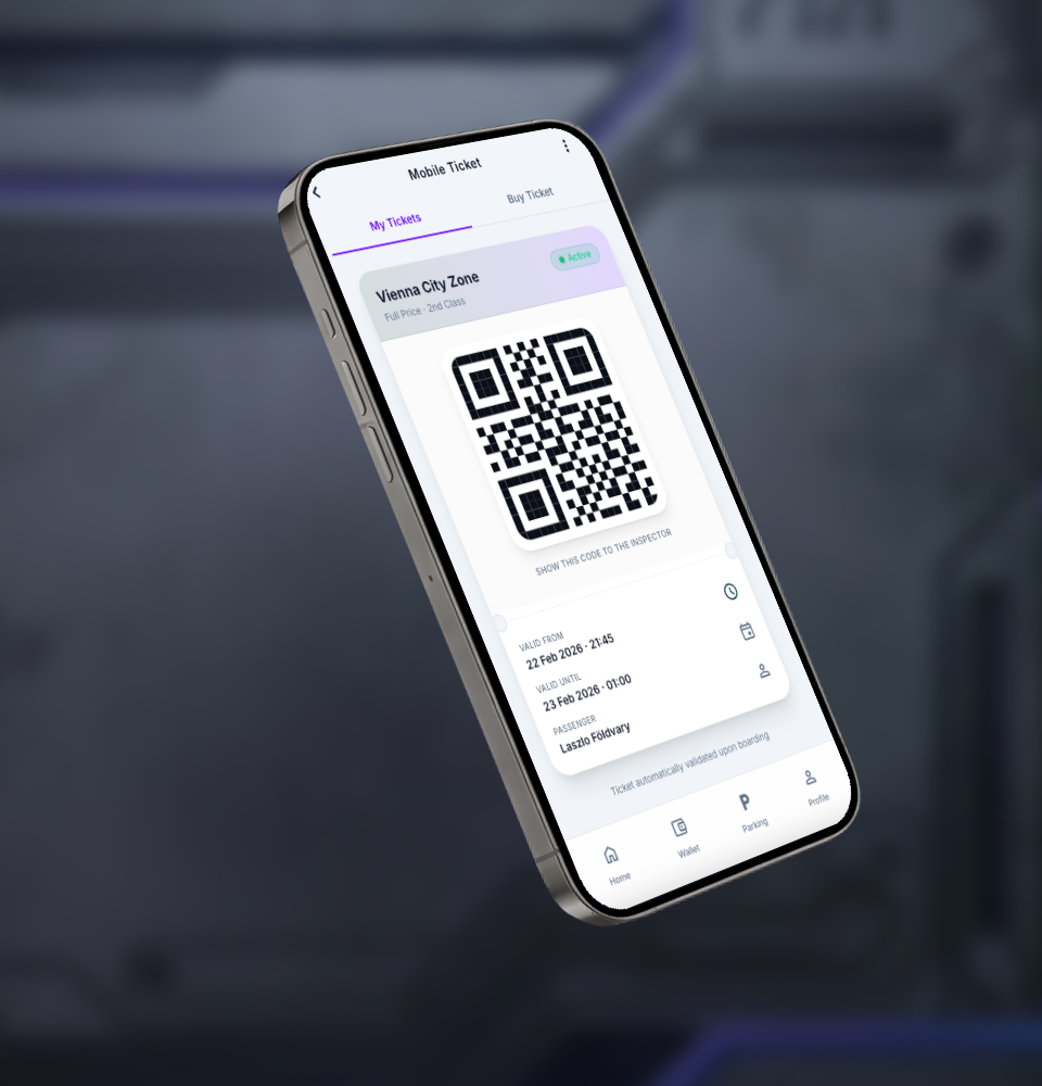
/ Research & Market Analysis
For this self-initiated MVP, I used NotebookLM as an AI-assisted research and synthesis tool. I combined UX studies, ergonomics material, fintech references, and mobility-service patterns to identify recurring pain points in wallet and payment experiences.
Complex interfaces
Reducing cognitive load through focused, minimal UI.
Lack of clear guidance
Step-by-step interactions that reduce uncertainty and help users complete key tasks.
Limited financial visibility
Clear visibility into balances, payments, ticket states, and transaction-related information.
/ User Flow

/ User Flow
A logical flow architecture keeps navigation predictable, purposeful, and easy to understand across multiple service categories.
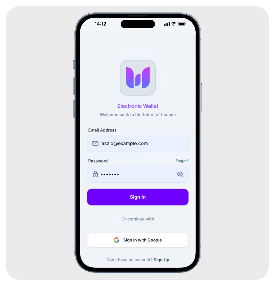
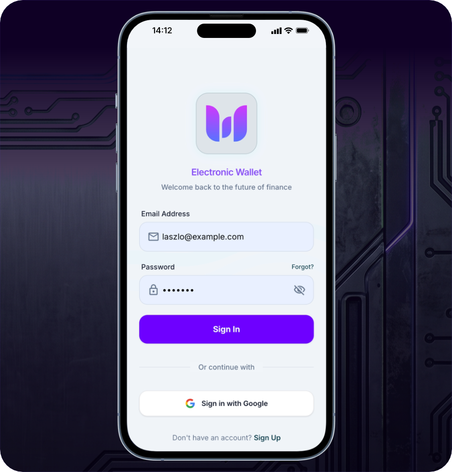
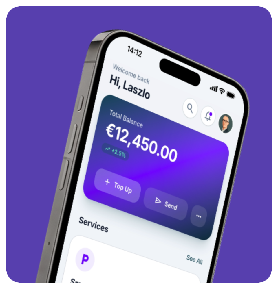
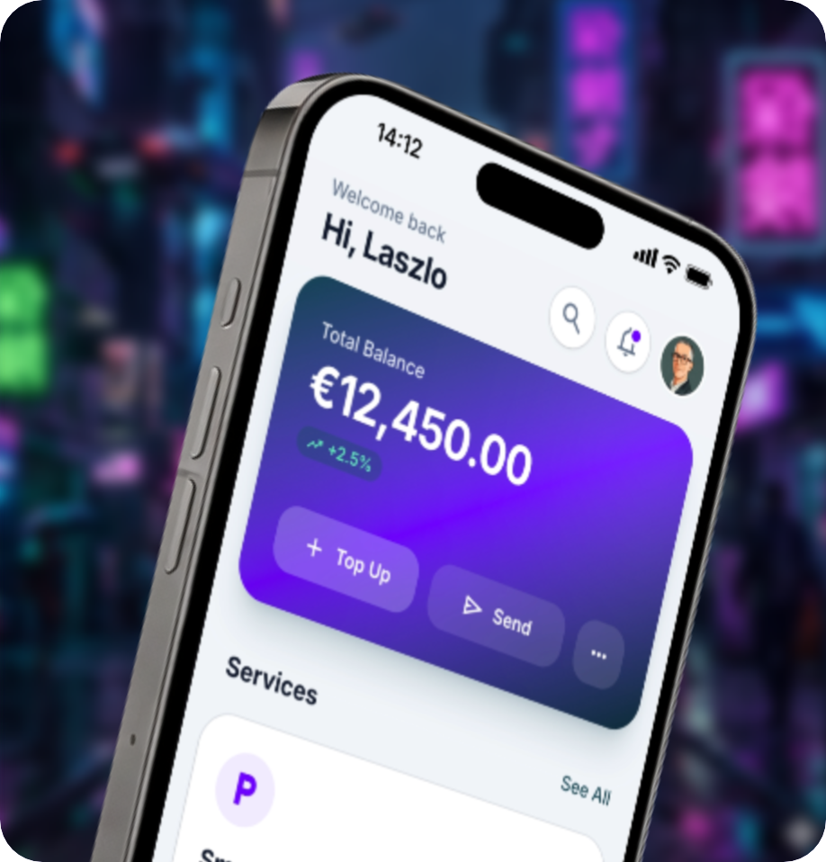
/ Typography
Inter was selected for its strong screen readability, tall x-height, and flexibility across interface sizes. It supports everything from small labels and navigation elements to complex wallet data, tables, and transaction information.
/ Color
The teal and purple palette was designed for dual-theme consistency. Each color was adapted for both Light and Dark environments to support contrast, accessibility-minded decisions, and a premium fintech feel across the product.
Light Theme
Dark Theme
/ Logo
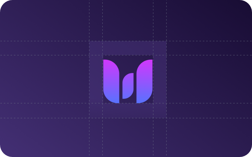
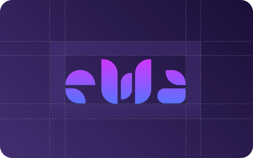
Old Logo
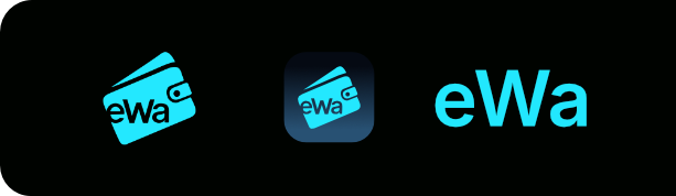
From Literal to Abstract
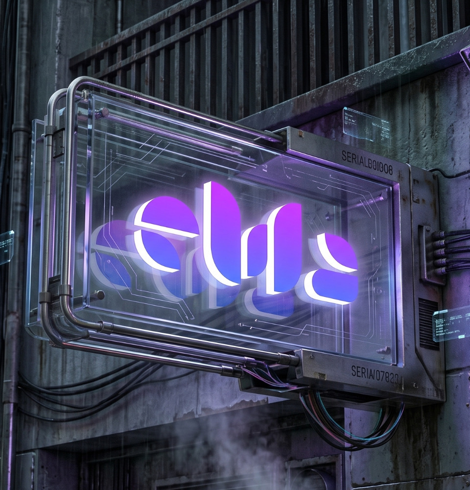
The original placeholder logo was too literal and generic for a fintech product. I redesigned the identity around a cleaner, more abstract mark that feels more premium, scalable, and appropriate for a modern mobility wallet.
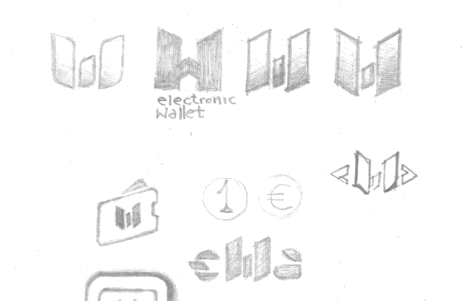
/ Brand Identity
/ Development: Designer as Builder
The handoff to engineering was not a static PDF. It was a working application.
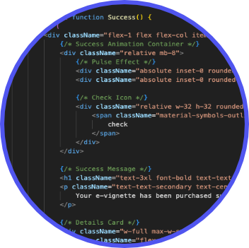
Using Google Antigravity and Flutter, I moved from drawing screens to building functional product logic, including simulated payment flows, cross-platform navigation, and deployable app structures.
UI mockups became working product surfaces. The result was not only a visual prototype, but an executable MVP that demonstrates how product thinking, design systems, and implementation can move together.
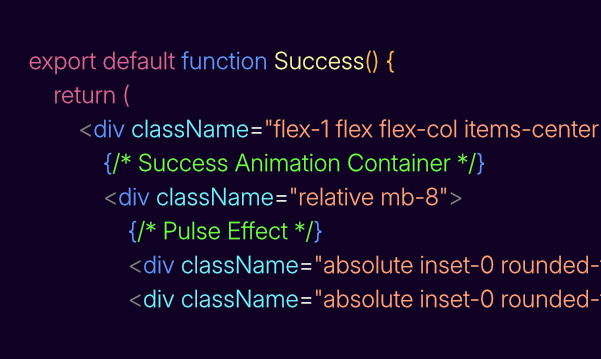
The handoff was not a static file. It was a working application with simulated product logic.
/ Deployment: Smart Cross-Platform Strategy
Smart Cross-Platform Deployment
To keep the project lean and accessible, I deployed a native Android APK alongside an optimized Web App. This allowed Android users to test a native-feeling experience while iOS users could explore the product directly from their mobile browser.
This approach avoided early-stage app store friction and kept the MVP focused on validation, accessibility, and product experience.


/ Brand Identity
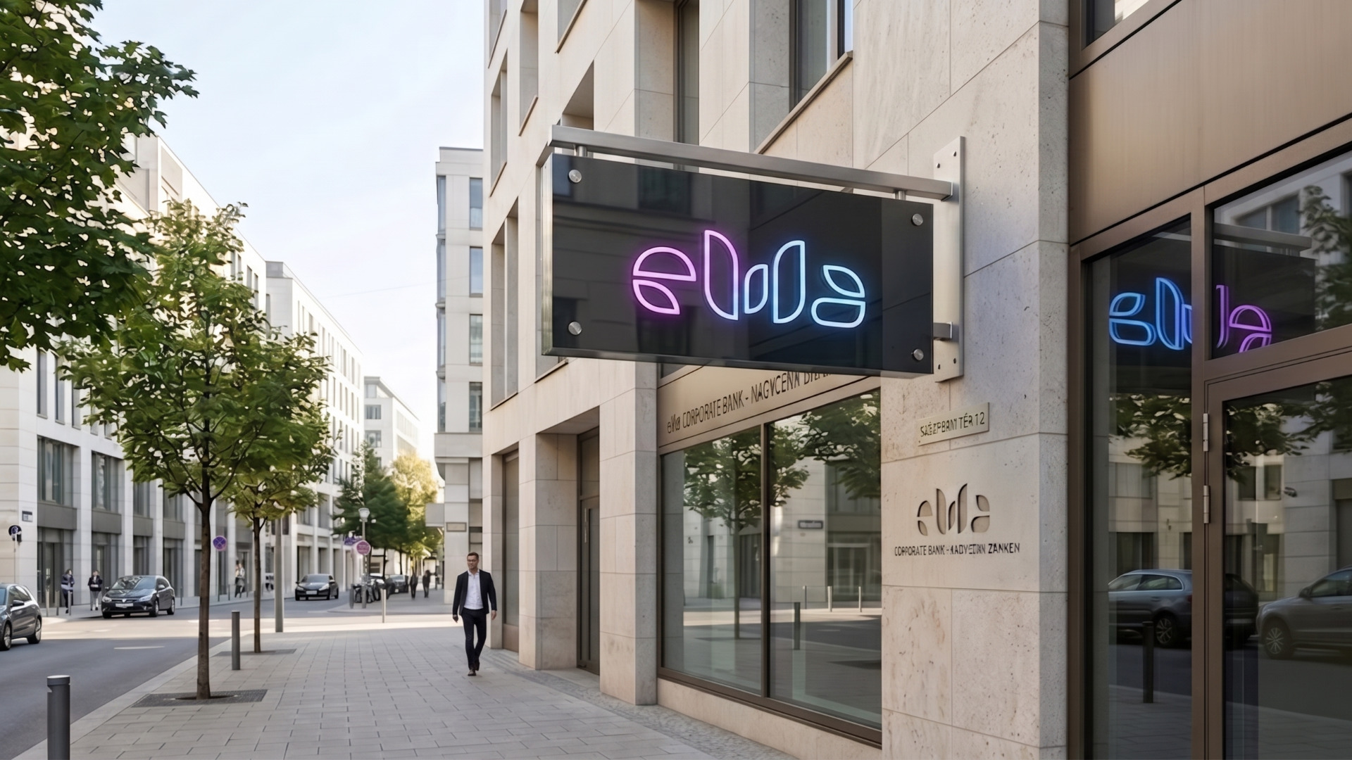
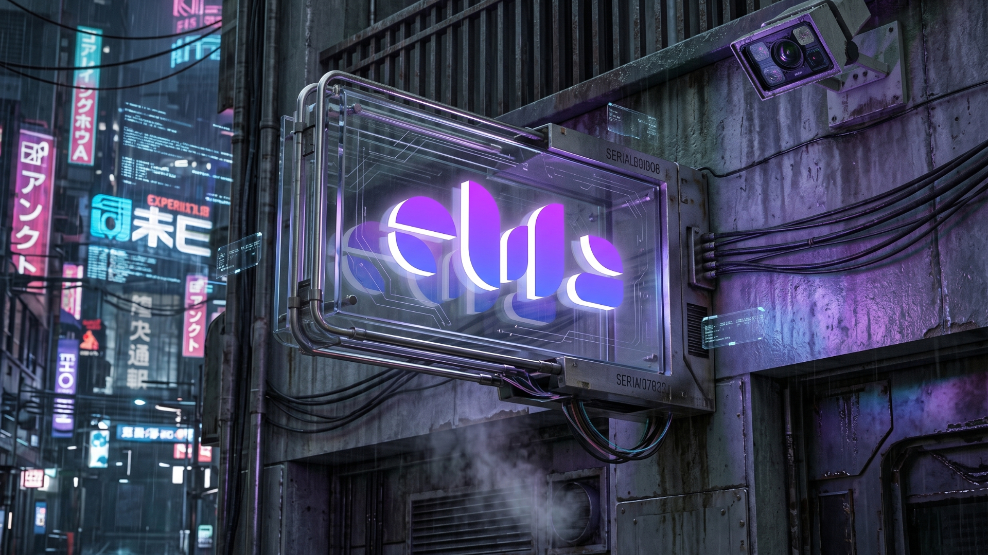
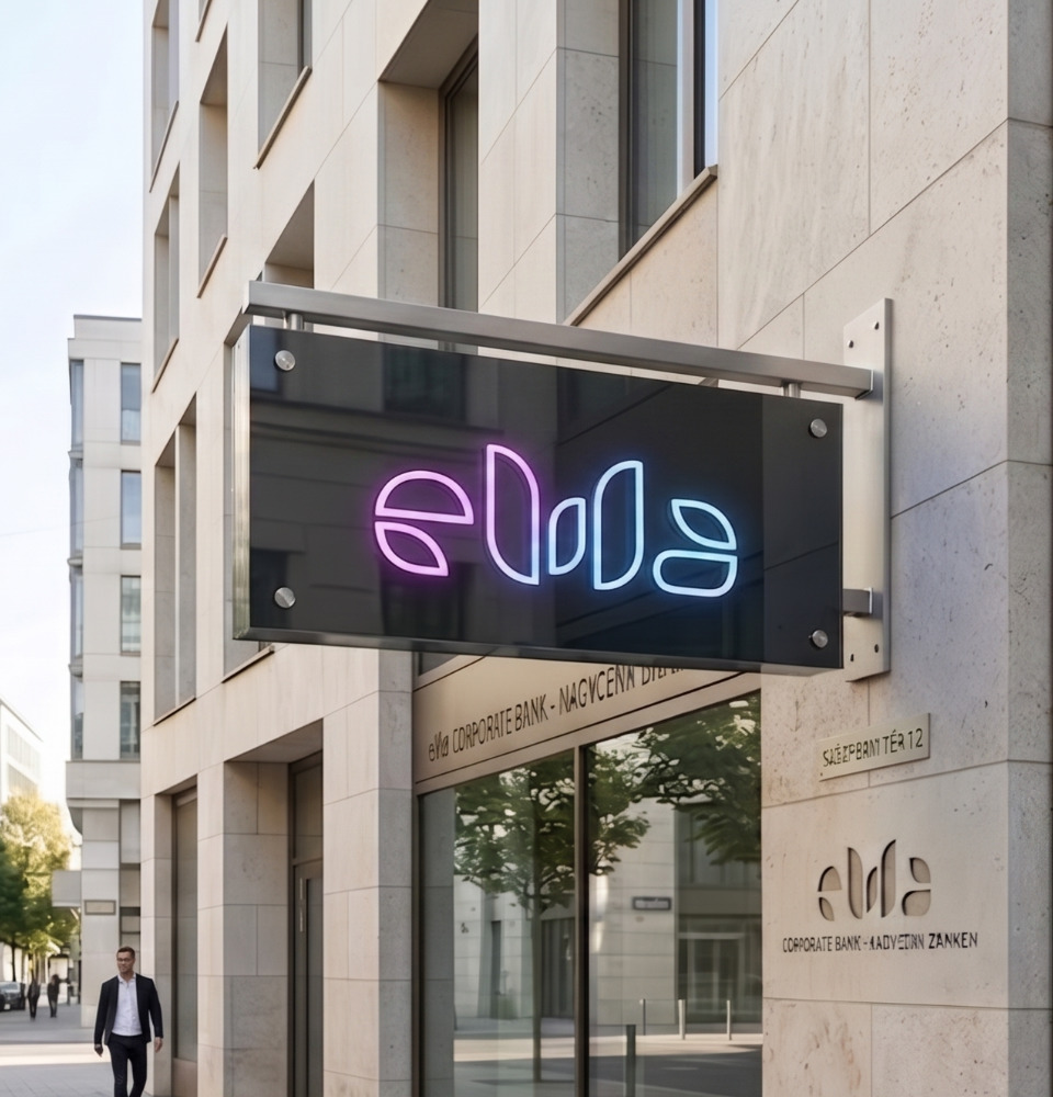
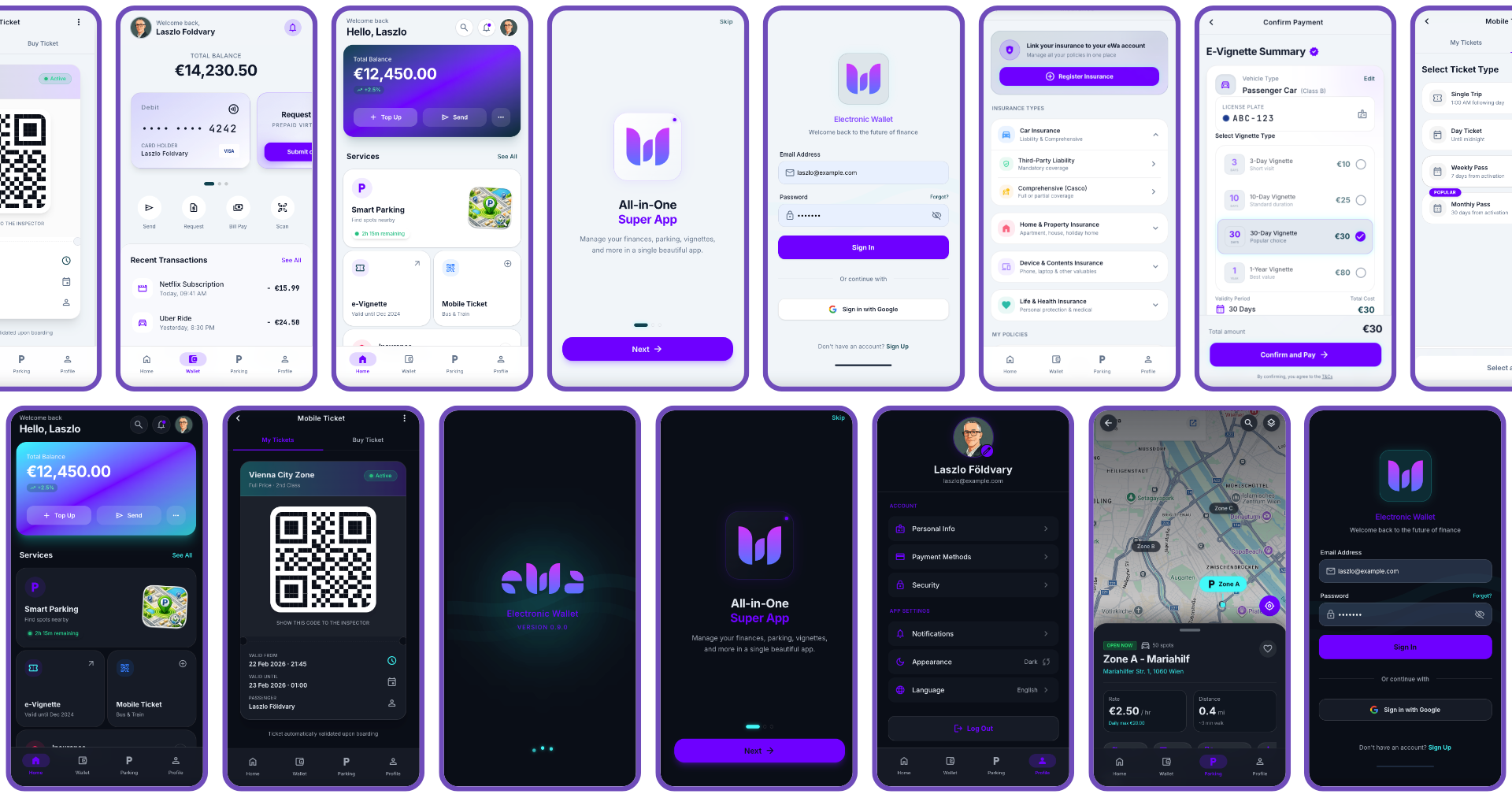
The eWa brand was designed to adapt across different services and product surfaces, from wallet interactions and mobility flows to payment-related screens and visual communication.
The goal was to maintain visual harmony, dual-theme consistency, and a premium fintech feel without making the interface feel heavy or overly decorative.
Product Vision
Future Roadmap & Vision
As a working prototype, eWa proves the product concept. The next steps would move it from MVP toward a broader market-ready wallet experience.
Phase 1
Expanding the Ecosystem
The immediate next step is turning the remaining UI placeholders — including Mobile Ticket and Insurance screens — into fully interactive, data-driven Flutter screens. This would complete the core wallet experience and create a smoother end-to-end journey across every eWa service.
- check Mobile Ticket & Transit screens
- check Insurance & document hub screens
- check Full data-driven Flutter integration
- German language activation
- check Light theme integration
- iOS implementation as a later-stage expansion
Phase 2
The Composable Subscription Hub
A differentiating future concept for eWa is a modular subscription hub where users can add, configure, and manage recurring services such as streaming, cloud storage, gym memberships, and other subscriptions. The goal is financial clarity: payment dates, recurring Euro costs, pause/cancel actions, and central control in one place.
Design That Thinks Through Implementation
The eWa Wallet App shows how deep UX/UI experience, product systems thinking, and AI-assisted workflows can help a designer act as a technical bridge-builder. Bridging the gap between business logic, user experience, and implementation is no longer just a positioning statement. In this project, it became an executable workflow.