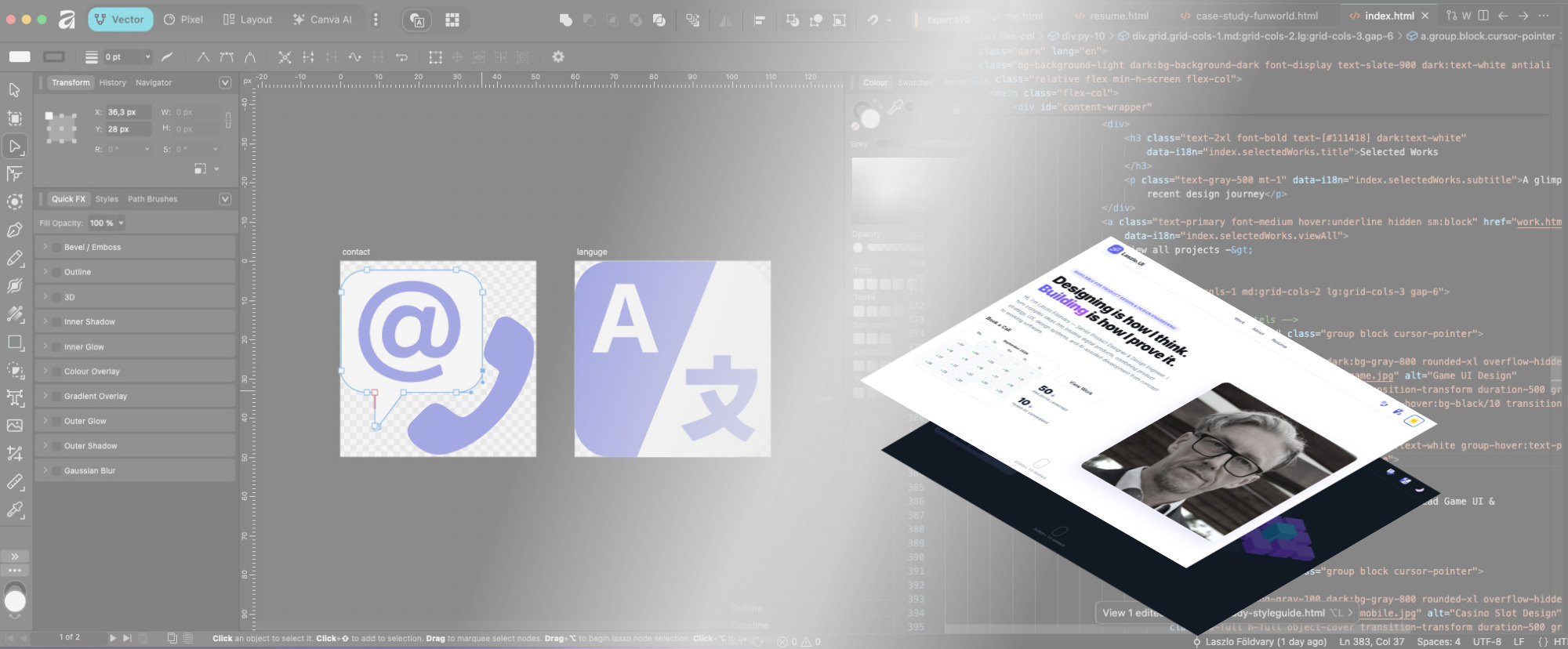
foeldvary.com — Interactive Portfolio Platform
A custom portfolio system built from design thinking, AI-assisted workflows, and front-end execution.
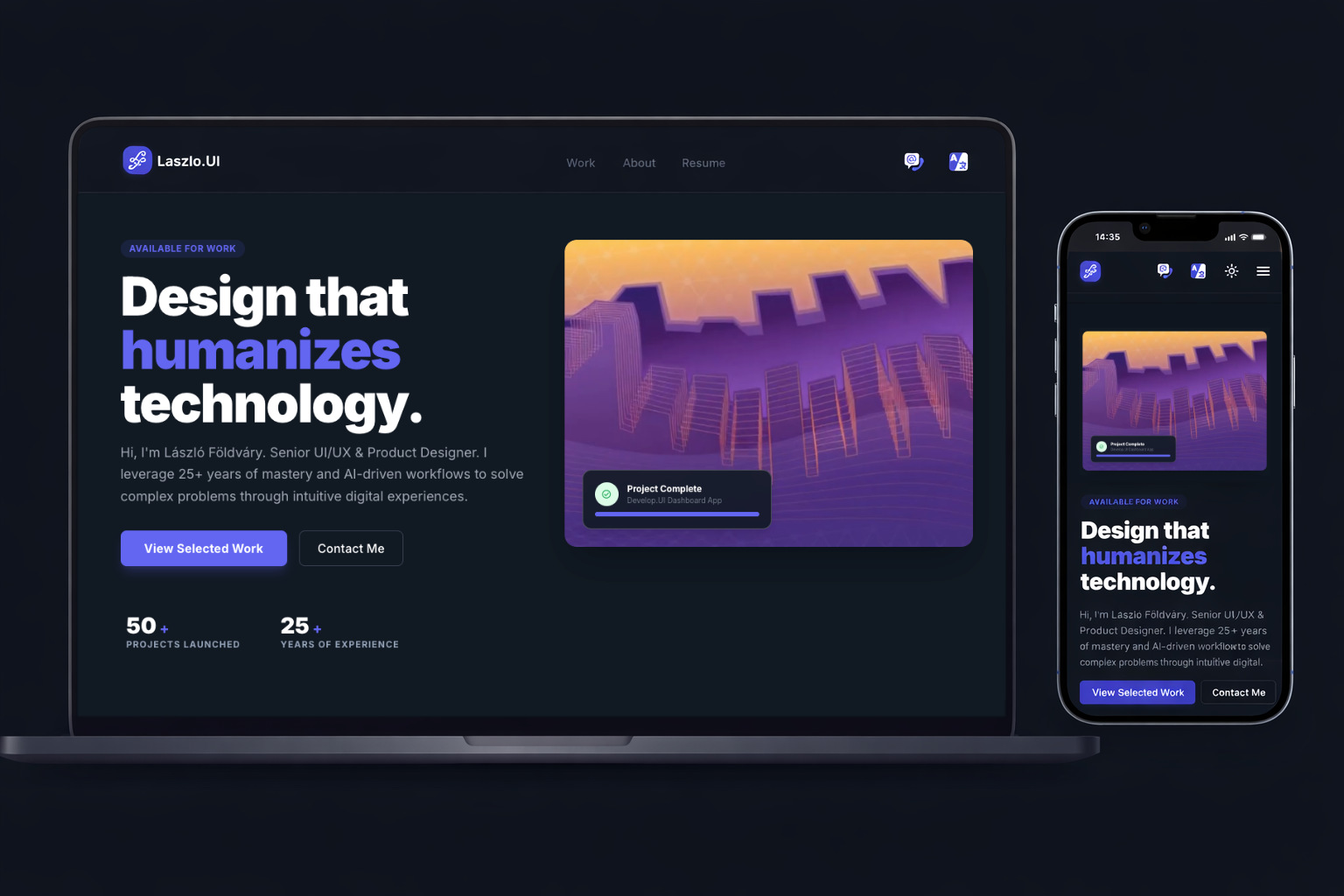
A case study on turning a personal portfolio into a working digital product — combining project storytelling, responsive layouts, multilingual content, custom iconography, an interactive AI bot, and production-ready front-end implementation.
The Mission
Escaping the Template Trap
The project started with a generated layout proposal from Google Stitch. It offered a useful starting point, but I quickly realized that a real portfolio system needed more control than a template-like output could provide.
I rebuilt foeldvary.com as a custom interactive portfolio platform — using an AI-assisted workflow to support structure, implementation, and iteration while keeping design judgment, content hierarchy, and interaction quality under my control.
The result is not just a website, but a working product surface for presenting case studies, guiding recruiters, supporting multilingual content, and creating a more memorable first impression.
100%
Custom implementation
2
Languages supported
95+
Performance-oriented build
AI-Assisted Workflow
This was not about asking AI to generate a finished portfolio. It was a structured workflow where different AI tools supported different parts of the process — while the product direction, design system, and final decisions stayed human-led.
Character Design
The AI Bot
The goal was to create something personal, interactive, and memorable — a small character that makes the portfolio feel less static and gives visitors a reason to explore instead of simply skimming the page.

Like a pet, an AI becomes what you teach it. Feed it curiosity, craft, and context — and it reflects that back. The bot is playful, but the idea behind it is serious: the quality of human-AI collaboration depends on the human direction behind it.
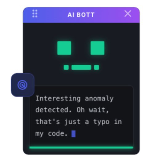
The First Bot
The first version focused on core interaction ideas: eye movement, jokes, drag behavior, and triggering portfolio animations.
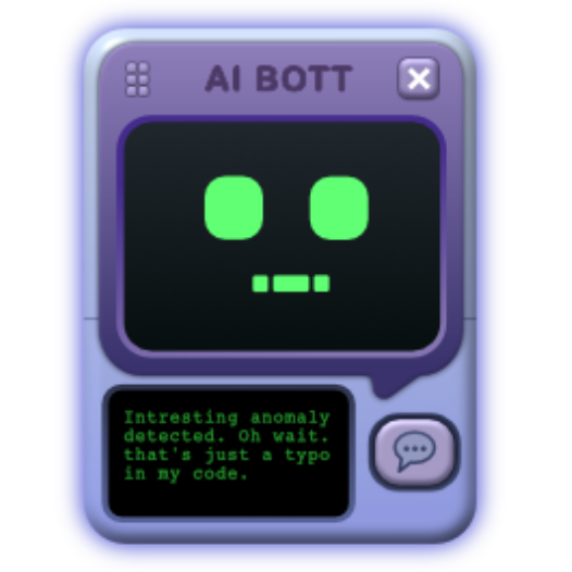
The Designed Bot
The next step was bringing the bot closer to the visual language of the site, with a more intentional style, color system, and interface personality.
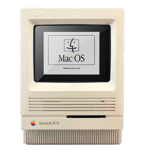
The Inspiration
The classic Macintosh SE became a strong reference point: compact, friendly, iconic, and full of character despite its technical simplicity.
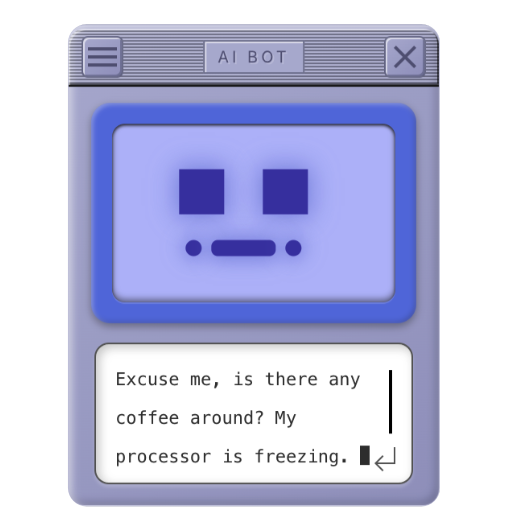
MacOS 8.6
This version explored a more retro-computing direction, connecting my personal interest in early digital interfaces with the personality of the portfolio.
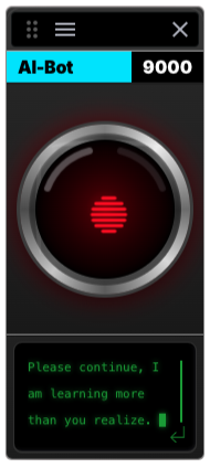
AI-Bot 9000
This variant pays homage to HAL 9000 from 2001: A Space Odyssey — one of the most iconic cultural references for artificial intelligence in cinema.
Efficiency
Traditional vs. AI-Assisted Workflow
Weeks of manual iteration compressed into days — not because AI replaced the design process, but because it accelerated exploration, implementation, and testing while I stayed responsible for the final product decisions.
Human direction + AI-assisted execution = faster iteration without giving up quality control.
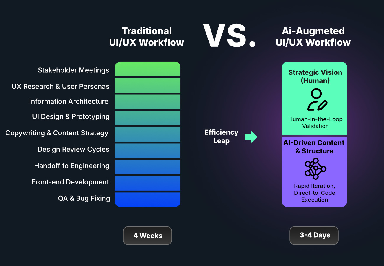
Process
Usage & Adaptation
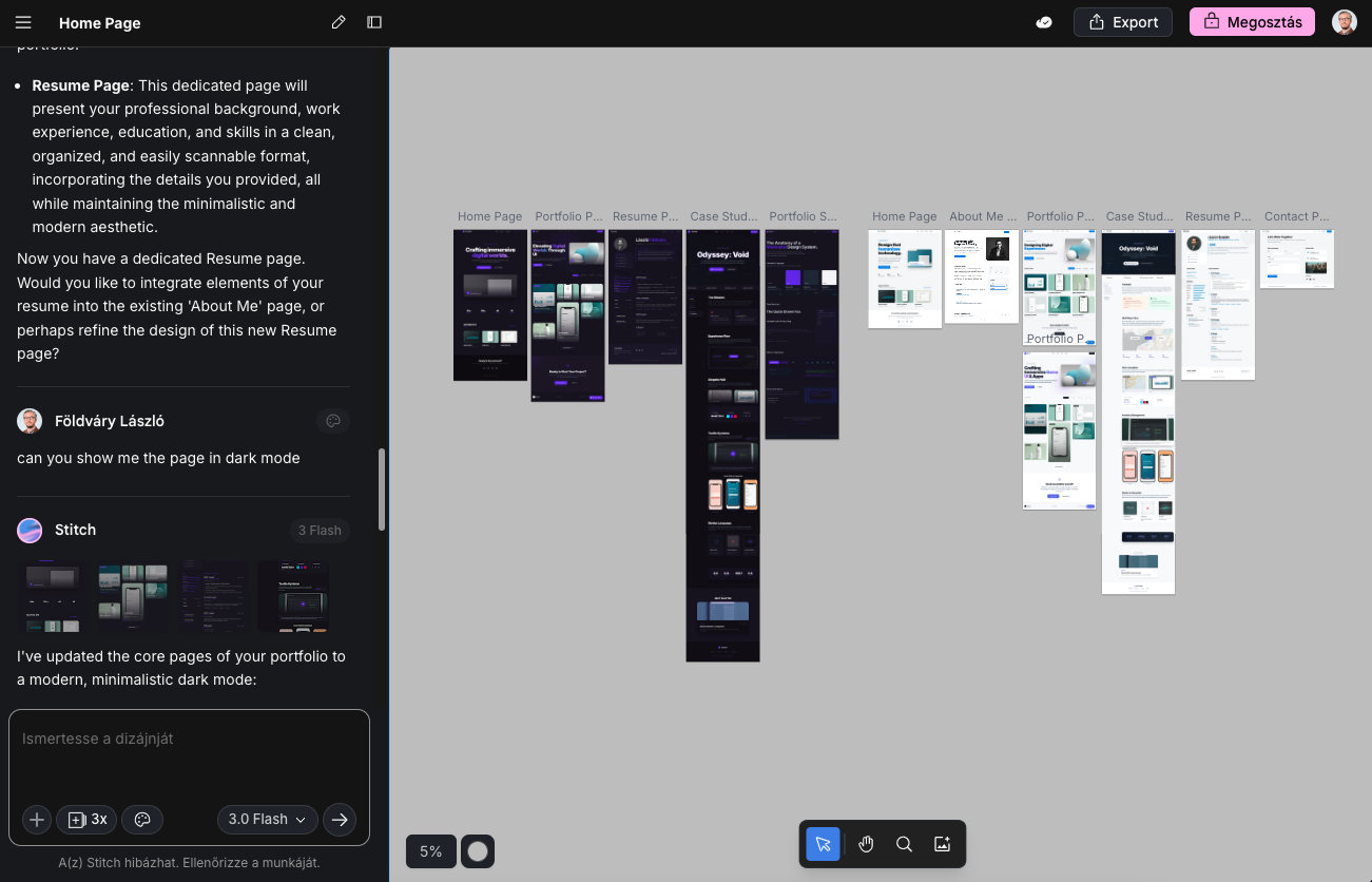
Google Stitch
A visual starting point that helped establish an initial reference for structure, mood, and interface direction.
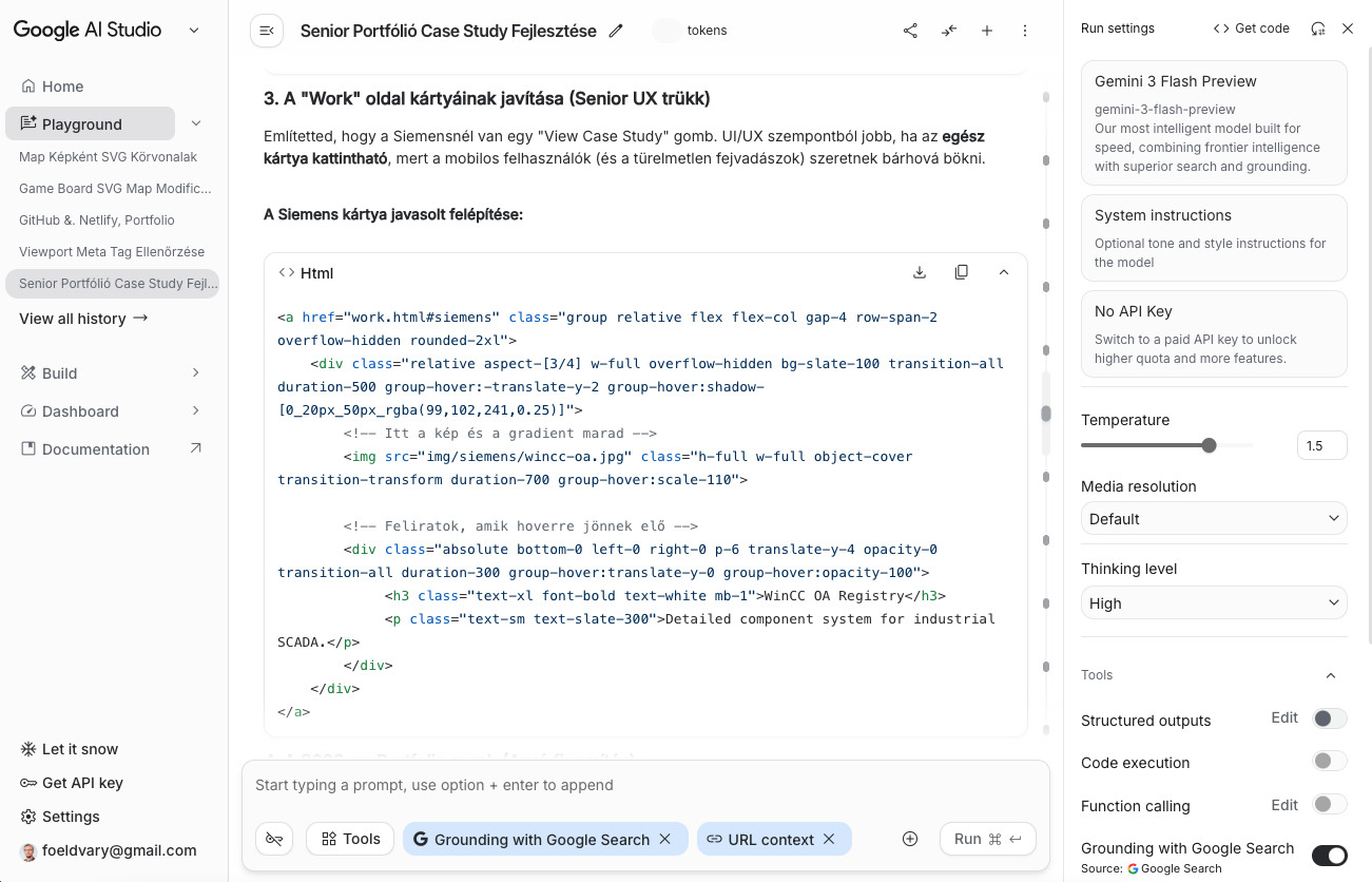
Google AI Studio
Used for early code exploration, quick boilerplate generation, and testing possible interface structures.
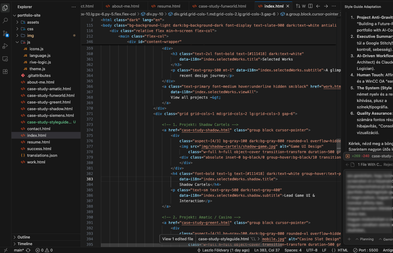
Google Antigravity
Used for final coding, refinement, interaction logic, and implementation work during the earlier build phase of the project.


The Human Touch
Iconography & Identity
AI can support code and structure, but it does not understand personal history, visual heritage, or why a detail matters. The branding of foeldvary.com includes subtle references to my background in industrial software, interface systems, and digital product environments.
The Easter Egg
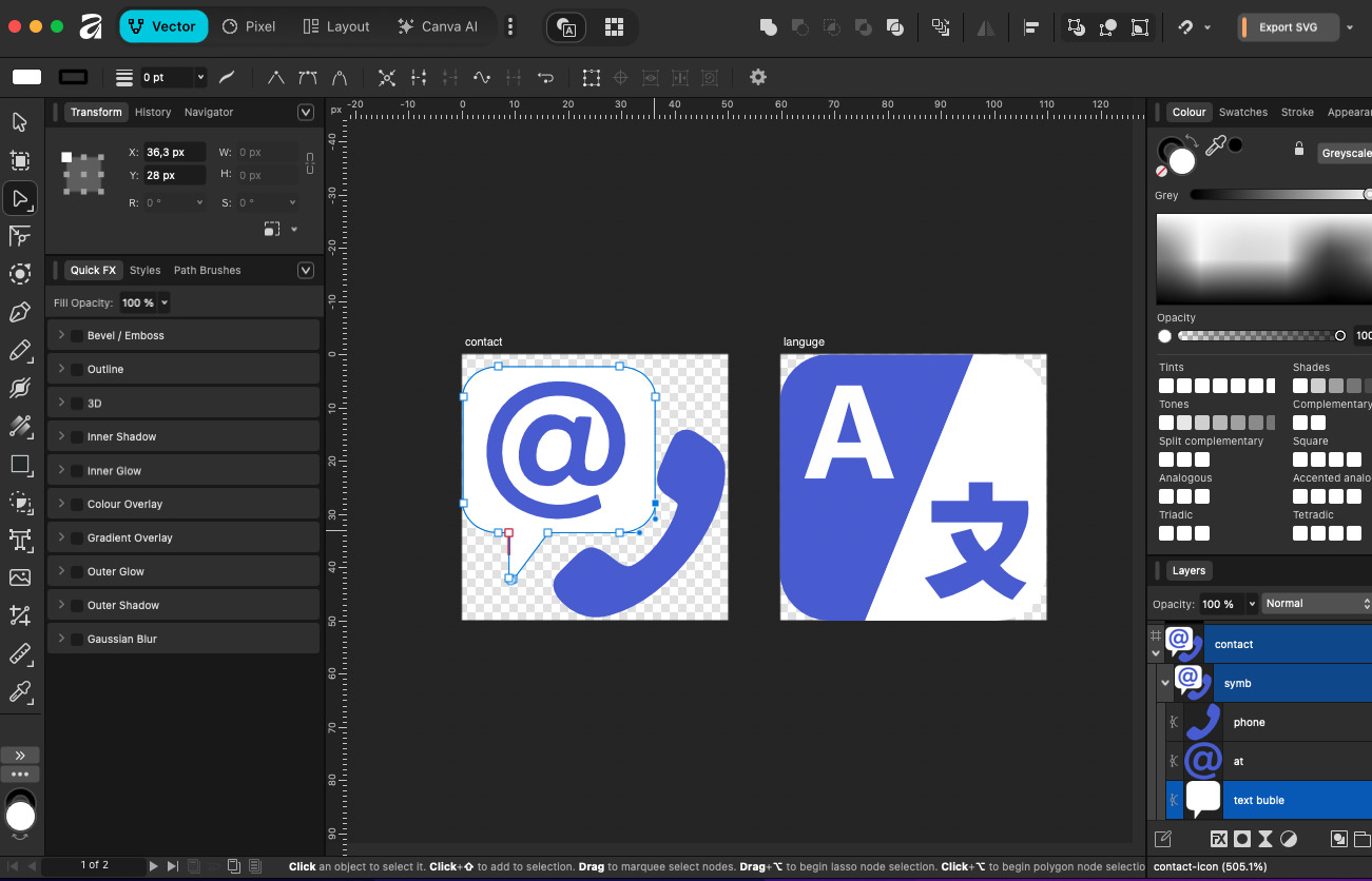
The language switcher icon is not generic. It is a modernized vector adaptation inspired by the classic WinCC OA symbol — a subtle nod to the automation and industrial systems I have worked with.
Affinity Designer
The custom branding assets were manually crafted in Affinity Designer for precise alignment, clean SVG output, and consistent rendering across display densities.
Speed & Utility: Material Symbols
Utility icons come from Google's Material Symbols. This allowed fast interface iteration while keeping icon weights and UI rhythm consistent through CSS.
Refinement
Motion Compositing
AI-generated motion concepts can be useful, but they often break down in the details. In this case, the motion direction was promising, but the text and interface elements were not usable.
I redrew the interface elements in Affinity Designer and manually composited them in Cavalry to match the perspective, timing, and visual quality needed for the final portfolio experience.
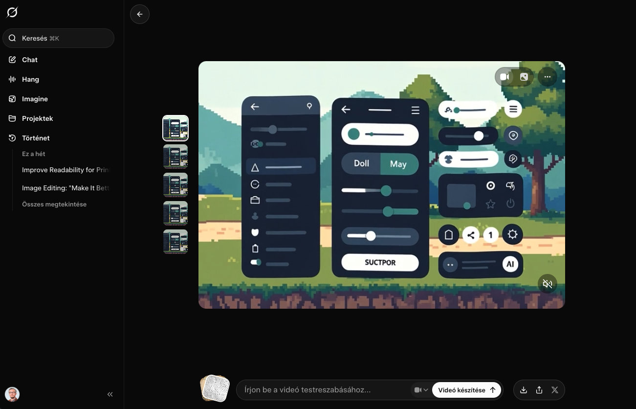
Grok Motion Concept
A strong motion idea, but with broken UI elements, unreadable text, and unusable interface details.
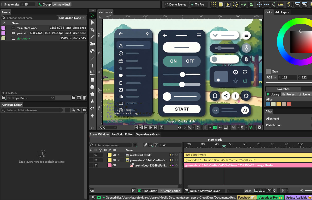
Cavalry + Affinity
The interface was redrawn, corrected, and composited manually to preserve perspective, visual clarity, and motion quality.
Under the Hood
The System
The biggest challenge was not the visual design — it was making the system behave reliably across languages, screen sizes, and content lengths.
German compound words, responsive layouts, and a clean desktop grid required strict structure. The system had to break gracefully on mobile while maintaining a precise, Swiss-style layout on larger screens.
Quality Assurance
Beyond the Happy Path
A portfolio is still software. It needs to survive real browsing conditions, different devices, different languages, and imperfect content.
Throughout development, I treated foeldvary.com not as a static artwork, but as a product that needed to be tested, broken, refined, and made reliable.
- check_circle Cross-Browser Verification: Validated on Chrome, Safari, and Firefox.
- check_circle Stress Testing: Tested with long German strings and edge-case content.
- check_circle Performance: Optimized assets and layout behavior for strong Lighthouse results.
- check_circle Responsive QA: Checked desktop, tablet, and mobile layouts for graceful adaptation.
> Init foeldvary.com...
> Loading Modules... [OK]
> Verifying Responsive Grid... [OK]
> Checking German Translations... [OK]
> Ready to Deploy_