
Air
Mobility, control and tactical distribution.
A fantasy card-battle R&D project exploring game systems, UX/UI, multiplayer and AI-assisted production.
Product Vision
The starting point was intentionally ambitious: create an original card-battle system that feels easy to understand at first glance while still supporting meaningful tactical decisions.
The game needed more than attractive cards. It required a coherent rule system, resource economy, battlefield logic, faction identities, readable states, responsive layouts and enough technical structure to support multiplayer play.
I approached it as a product rather than a collection of screens. Every visual decision had to connect back to gameplay, feedback, state or player choice.
This was a game-system design problem before it was a UI problem.
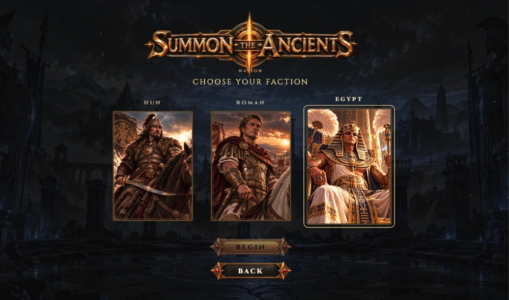
The faction architecture was designed to grow beyond the current roster. Future factions are planned as mechanically and visually distinct factions rather than simple cosmetic variations.
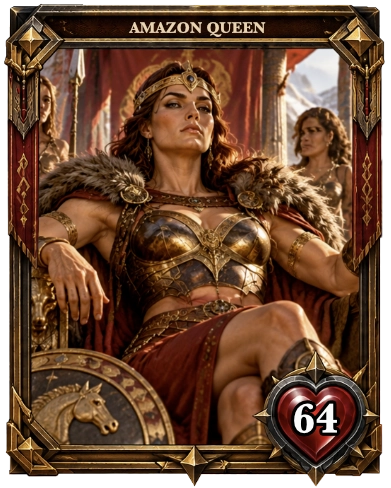
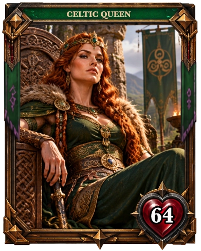
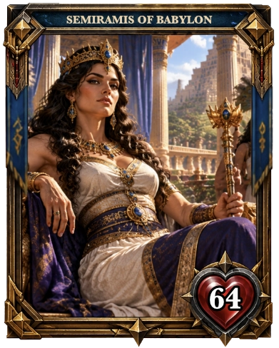
System Design
Building the game meant designing an interconnected economy rather than balancing isolated cards. Cost, Attack, Life, timing and special abilities all affect tempo, board control and the opponent’s ability to respond.
The goal was not mathematical symmetry. Each faction needed a clear identity, distinct strengths and weaknesses, and enough counterplay to keep powerful mechanics from turning into automatic wins.
Mobility, control and tactical distribution.

Defense, manipulation and resilience.

Direct damage, aggression and pressure.

Healing, growth and durable creatures.
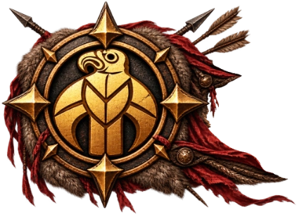
Faction-specific mechanics and historical identities.
01
Powerful effects must justify their resource cost and timing.
02
Strong mechanics should still leave the opponent meaningful ways to respond.
03
Early advantage should matter without automatically deciding the match.
04
Resource growth and repeatable effects need limits to prevent runaway advantage.
05
Each faction should solve problems differently rather than becoming a visual reskin.
Balance in Practice
Before
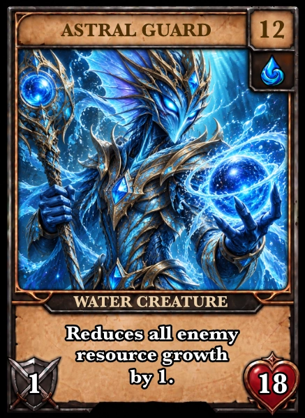
18 Life
The Problem
High survivability combined with repeated resource denial could suppress the opponent’s ability to play cards. The mechanic was thematically strong, but created a soft lock with too little meaningful counterplay.
18 Life → 10 Life
Lower survivability created a realistic response window.
Same identity. More counterplay.
After
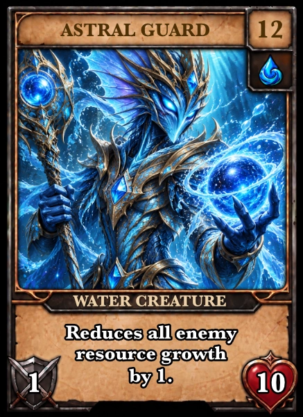
10 Life
Balance became an iterative system problem: changing one value or ability can affect resource growth, board control, Hero damage and several turns that follow.
UX System
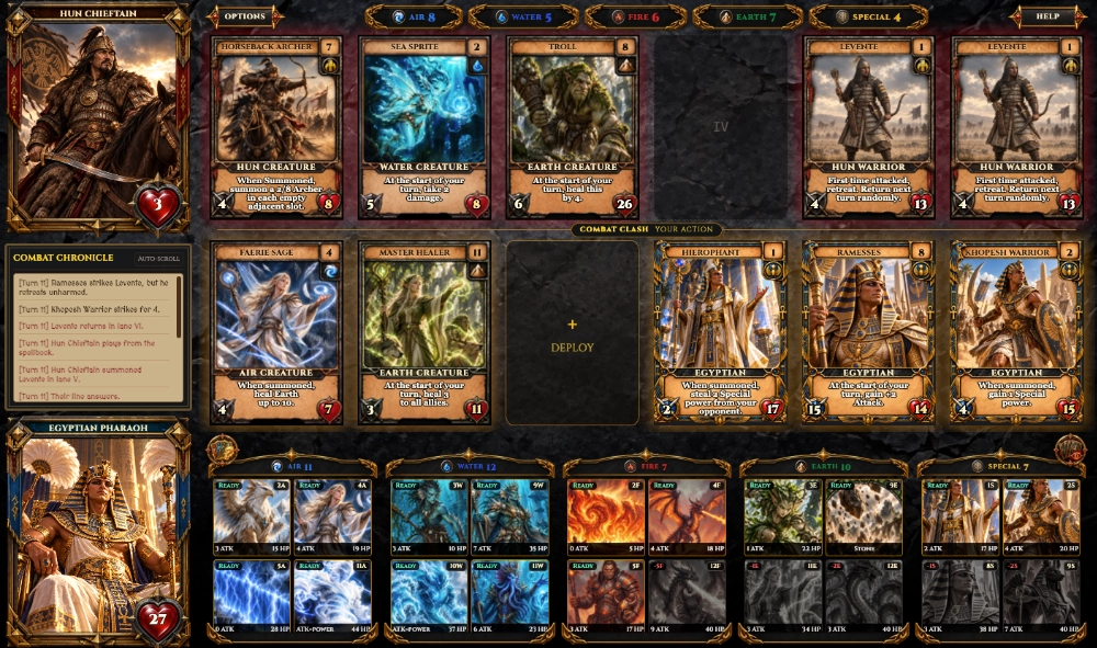
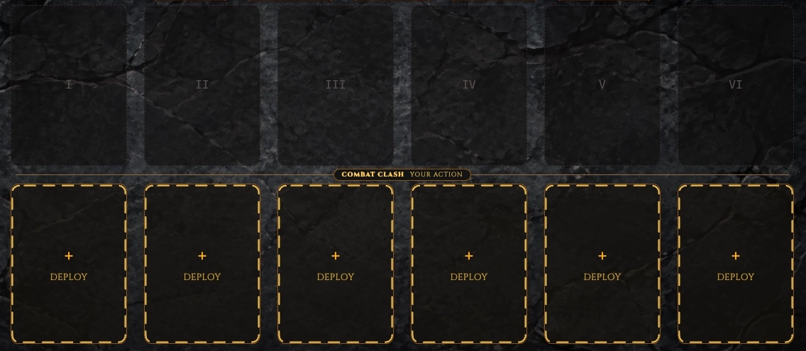
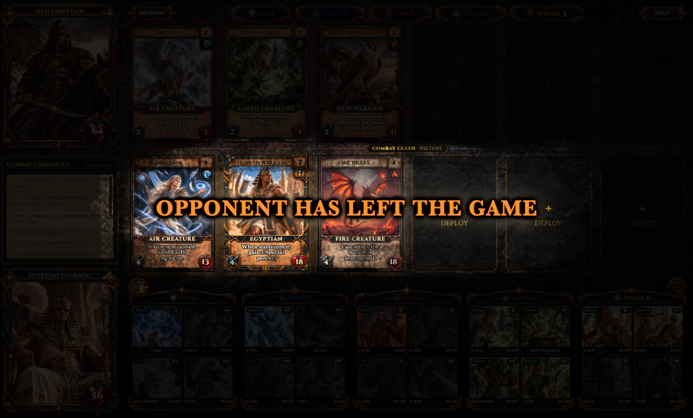
The battle screen carries a large amount of information at once: two Heroes, six opposing lanes, five resource pools, a Spellbook, combat feedback, card availability and turn state.
The UX challenge was not to remove this complexity, but to structure it so that players can quickly answer three questions: What can I do? What is happening? What should I pay attention to next?
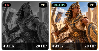
Cards communicate whether they are playable, unavailable, waiting for resolution or blocked by insufficient resources. Battlefield slots communicate valid placement, while Hero Life, resources and turn state remain continuously visible.
The goal was to make important states readable before relying on decorative styling.

Player Support
Complex strategy systems should not require players to remember everything or always know the optimal next step. I added optional support features that reduce uncertainty while preserving player agency.
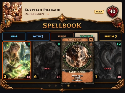
When a player is unsure what to do next, the game surfaces a contextual recommendation and highlights a valid card without taking control away from the player.
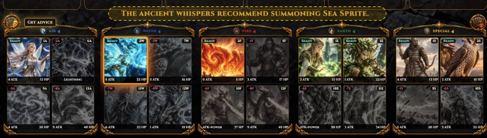
Guidance without automation.
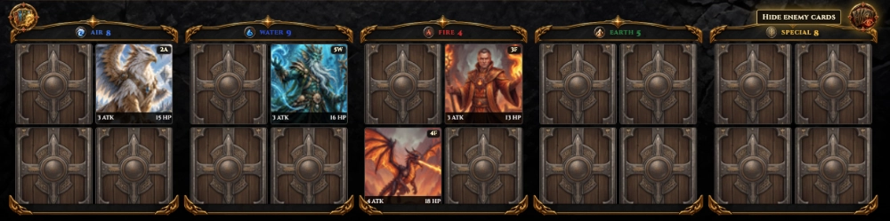
Players can switch the Spellbook into an opponent view to review cards that have already been revealed during the match instead of relying on memory alone.
Reduce cognitive load without revealing hidden information.
The system helps the player think — it does not play for them.
Responsive UX
The desktop interface could not simply be scaled down. A card game presents too much simultaneous information for that approach.
Mobile required a different hierarchy: battlefield first, active cards second, supporting controls only when needed. Navigation, Spellbook behavior, card previews and Help were therefore redesigned around touch interaction and limited screen space.
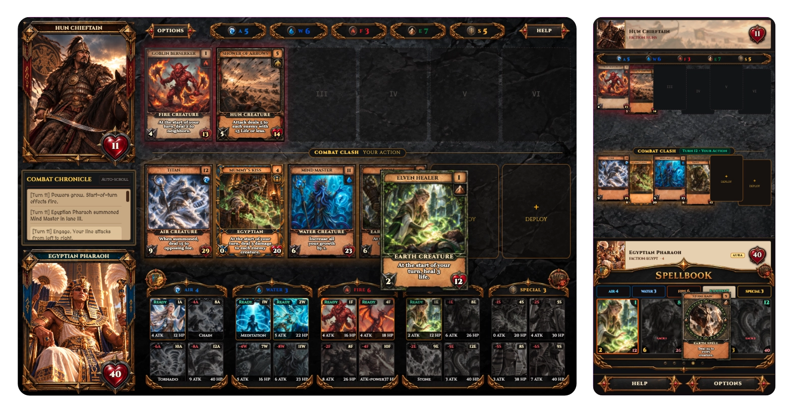
Keep the current decision and battlefield state visually dominant.
Cards need enough space and separation to support deliberate touch interaction.
Card details appear when needed without permanently occupying valuable screen space.
Help and Options remain accessible without competing with the core gameplay.
Responsive design solved dimensions. Mobile product design solved priorities.
Learnability
Summon combines resources, card types, faction mechanics, keywords, lane rules and combat timing. A one-time onboarding overlay would not be enough.
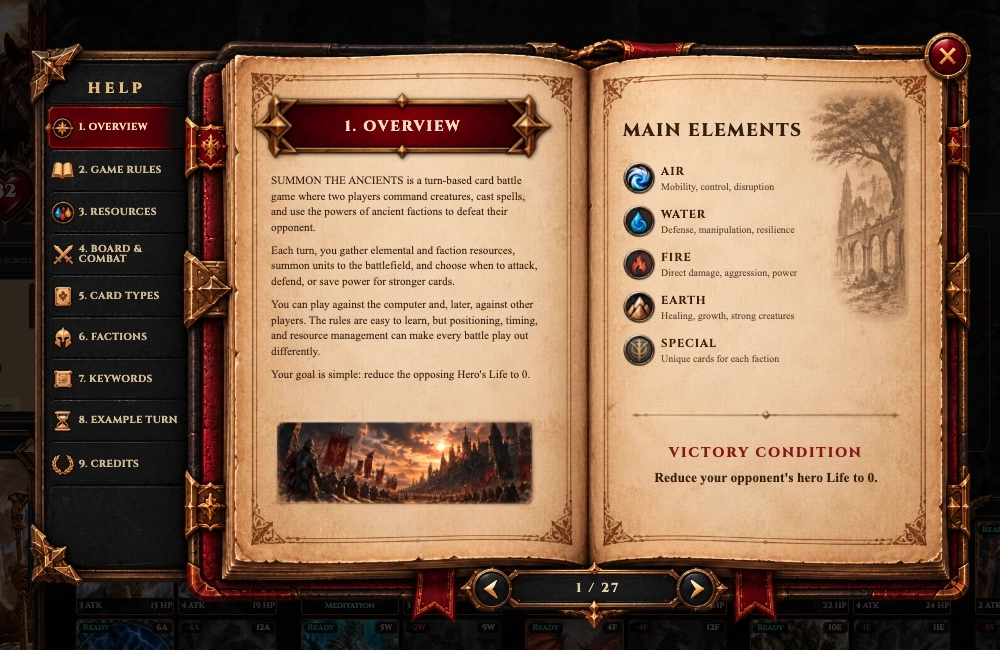
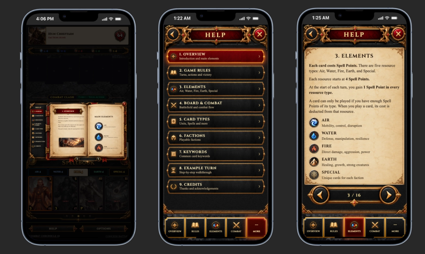
I designed the Help system as a permanent reference players can return to whenever they need clarification.
Desktop
On desktop, the documentation behaves like an illustrated rulebook. Persistent chapter navigation keeps the structure visible while individual pages explain rules with examples and diagrams.
Mobile
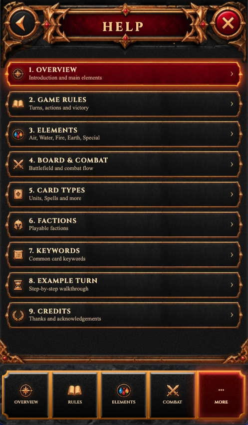
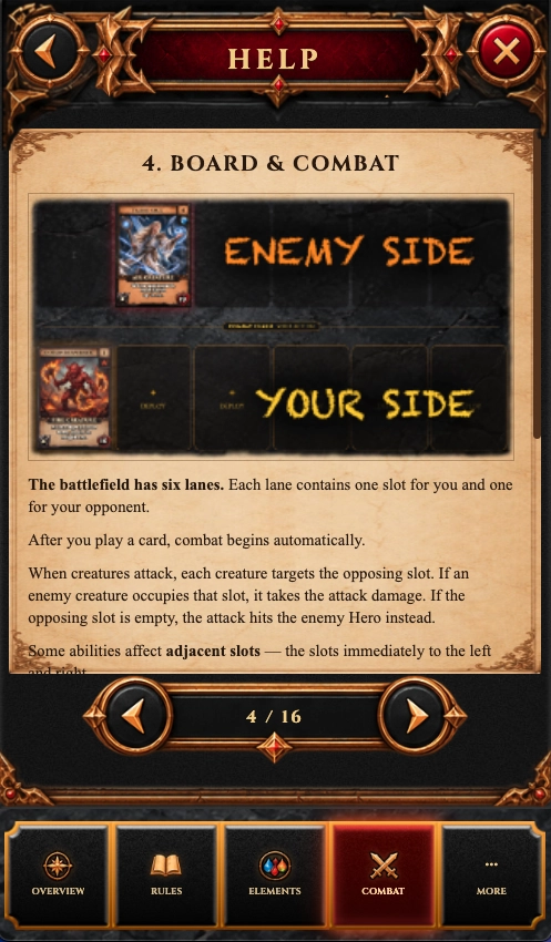
On mobile, the book metaphor was deliberately abandoned. The same content becomes a section-based navigation system with large touch targets, persistent category access and focused reading pages.
The content stayed consistent. The interaction model changed with the device.
Real-Time Product Logic
Adding multiplayer changed the game from a local experience into a shared product flow. Two players now need to enter the same match, choose their factions, become ready and stay aligned around the same game state.
Players can either enter a Quick Match and be paired automatically, or create a private game and share a room code with a specific opponent.
Once both players are connected, each chooses a faction independently. The match begins only when both sides are ready.
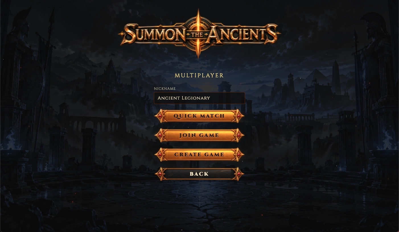
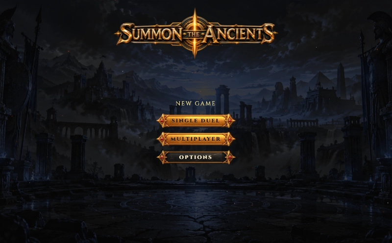
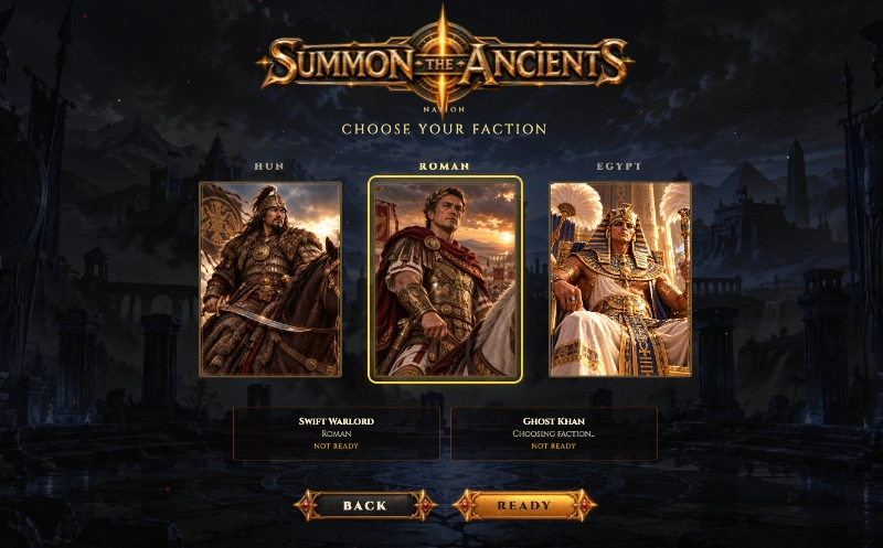
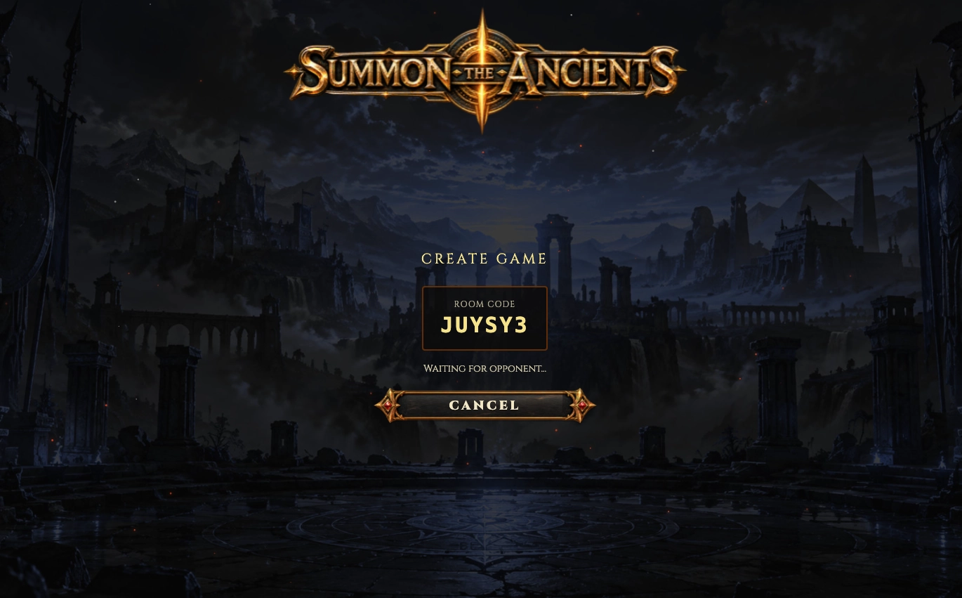
The interface stays simple. The complexity lives behind it.
AI-Assisted R&D
AI supported specialised parts of the production process, but it did not define the product. I used different tools for different strengths while keeping product direction, system design, evaluation, integration and final decisions under my control.
Concept exploration · game rules · balance analysis · UX reasoning · system planning · iterative consultation
Characters · factions · card illustration · visual exploration
Music generation and soundtrack exploration
Video generation and motion exploration
Small sound effects and audio details
Implementation support · debugging · refactoring · multiplayer iteration · GitHub workflow · Vercel deployment and configuration
Generated assets were only the starting point. I manually reviewed and prepared the material for production:
I also configured the project workflow around GitHub and Vercel so the game could be deployed, tested and iterated as a live web product.
Product direction · system design · UX/UI · art direction · tool selection · evaluation · asset preparation · integration · final decisions
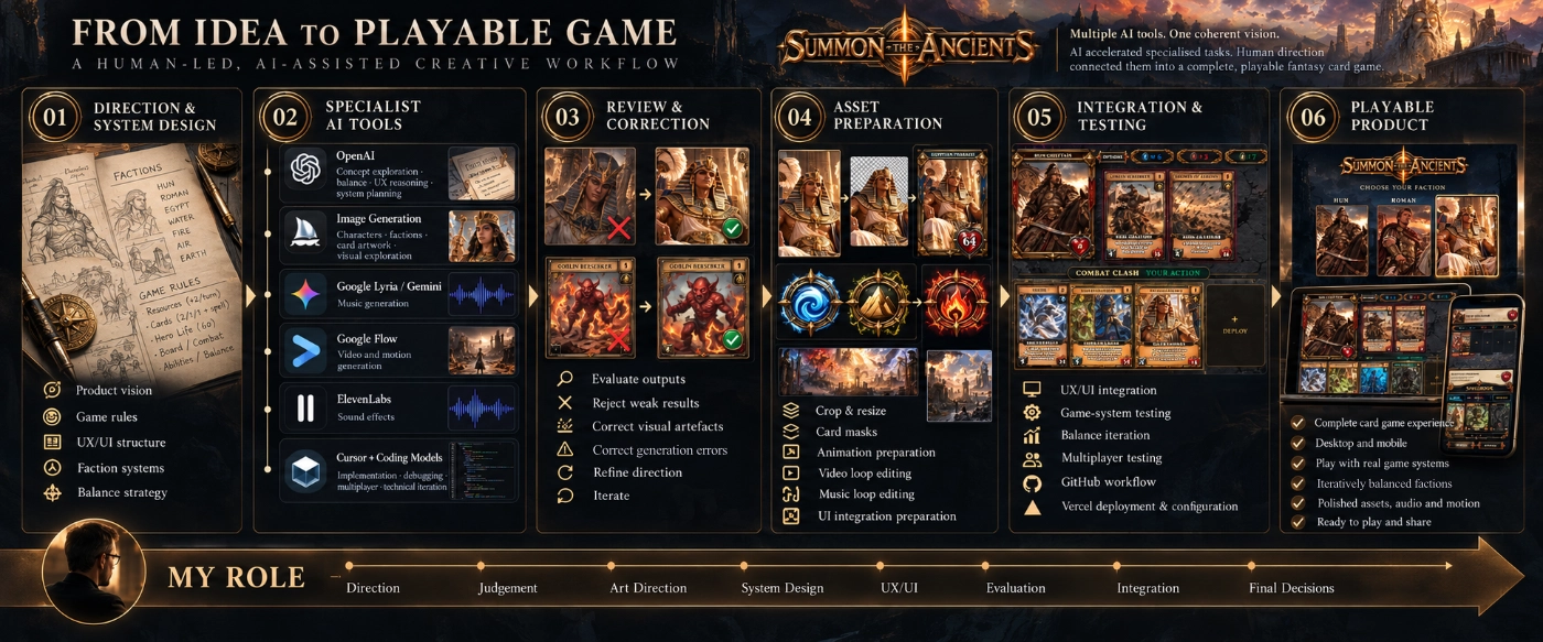
AI accelerated specialised tasks. The real work was directing, evaluating, correcting and integrating those outputs into a coherent playable product.
Design Through Iteration
A playable system reveals problems that static design cannot. Rules that looked reasonable on paper produced unexpected combinations. Mobile layouts exposed interaction-density and prioritisation issues. Multiplayer introduced shared-state and feedback problems that did not exist in single-player mode.
Each problem became another iteration: build, test, observe, adjust and repeat.
01
Adjust costs, Life, Attack and abilities when combinations create excessive advantage or hard locks.
02
Restructure interaction instead of forcing desktop layouts into smaller dimensions.
03
Make combat resolution, resource changes and card effects visible.
04
Test both player perspectives, make turn ownership explicit and resolve disconnect, recovery and shared-state edge cases.
05
Keep factions visually distinctive while preserving one shared interaction language.
Iteration in Practice
Build, play, observe, adjust — then repeat.
Result
5
Resource Systems
Air · Water · Fire · Earth · Special
6
Tactical Battle Lanes
Shared battlefield structure
3+
Playable Factions
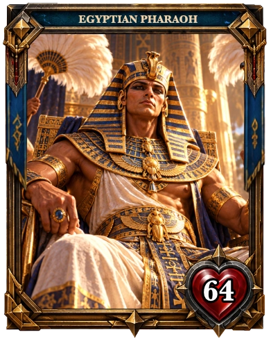
Hun · Roman · Egypt, with further factions in development
3
Interface Languages
English · Deutsch · Magyar
Desktop + Mobile
Responsive Game Experience
Different interaction priorities for different screen sizes
~2 Weeks
Initial Playable Build
From first system concept to a functioning playable game
What began as an independent R&D experiment became a working card-battle system with responsive interfaces, faction-specific mechanics, persistent rule documentation and real-time multiplayer.
The project proved that rapid AI-assisted production can still remain design-led when system thinking, evaluation, iteration and integration stay under human control.
Gameplay
Screens explain the structure. Gameplay shows how the system behaves once cards, resources, effects and combat begin interacting in real time.
The video follows a complete single-player flow: from splash screen and faction selection through card deployment, spell effects, opponent-card review, Help navigation and combat resolution — ending in a full Victory state and return to the main menu.
The goal was not only to design the interface, but to make every state, action and consequence readable while the game is moving.
Project Takeaway
Summon became more than a visual game concept. It became a practical experiment in designing an interconnected product where rules, interface, feedback, technical constraints and content continuously influence one another.
The project reinforced an approach that also defines my professional UX/UI work: better decisions on the screen come from understanding the system behind it.
Designing the interface was only one part of the challenge. The real work was keeping the entire system understandable, playable and coherent.